
Understanding the complexity of user journeys
Until recently, it was quite hard to see the full user journey because analyzing complex, branching user flows with traditional visualizations was nearly impossible. We just didn’t have a clear way to capture every path and pinpoint exactly where users dropped off, leaving our conversion analyses incomplete.
- The main problem was that conventional tools couldn’t display the multiple branching paths, like a simple funnel chart, so critical insights were often missed.
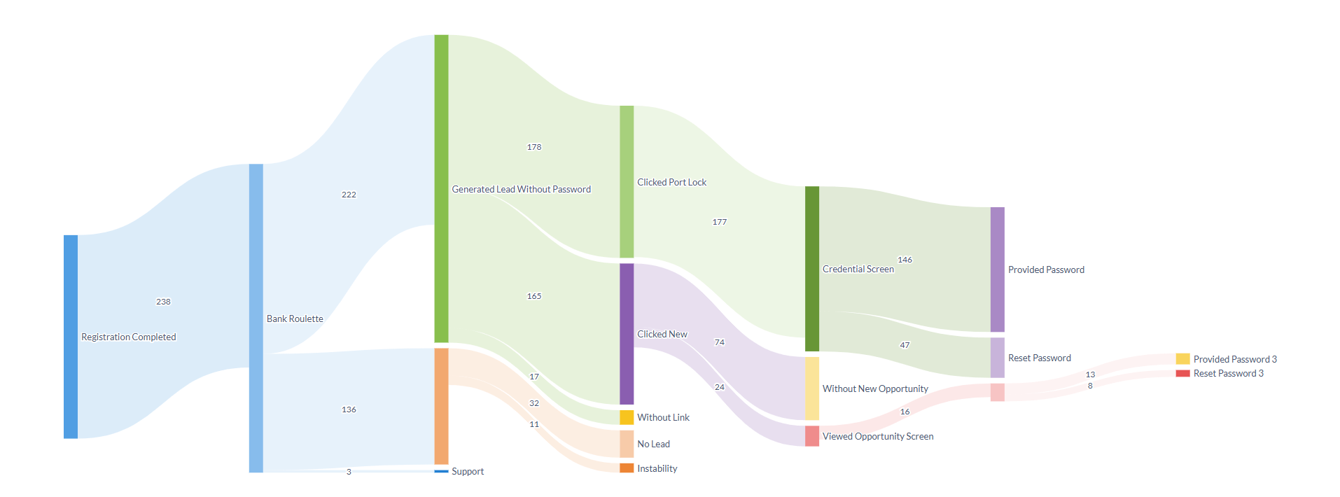
I had the chance to tackle this challenge head-on by transforming millions of raw event logs into a clear visual narrative of our conversion funnel from registration to lead generation using Metabase’s new Sankey chart visualization. This breakthrough not only revealed the intricate user transitions but also delivered actionable insights that helped refine our conversion strategy. (For more technical details, feel free to check out my GitHub repository)
Here is a walkthrough of the whole setup discussed by Thallys.
Data challenges in user journeys
Working with millions of event records comes with its own set of challenges:
- Duplicate events. Users might trigger the same action repeatedly (like clicking a support button multiple times), which can inflate our metrics if not filtered out.
- Chronological integrity. It’s vital that events occur in the correct order for example, registration must come before the credential screen is viewed, and that view must precede any subsequent actions.
- Efficient filtering and aggregation. Handling large datasets requires a robust SQL query that filters and aggregates data efficiently while preserving the correct sequence.
Addressing these issues was crucial to building a reliable Sankey chart for the user journey that shows where users drop off and where conversions occur.
Building a user journey step by step with SQL
To break down the problem, I divided the conversion funnel into distinct stages using Common Table Expressions (CTEs).
Step 1: Early filtering
I started with a base CTE to filter the raw data early on, a crucial step when handling large datasets.
WITH events_data AS (
SELECT
ke.user_id
,ke.event_timestamp
,mu.user_creation_date
,ke.event_id
,mu.user_origin
,ke.plataform_origin
,mu.covenant
FROM dbdelivery.tb_konsidb_events ke
JOIN dbdelivery.tb_mongo_users mu
ON ke.user_id = mu.user_id
WHERE mu.covenant IN (
'PREFEITURA DE GOIÂNIA',
'GOVERNO DO RIO DE JANEIRO',
'GOVERNO DE AMAZONAS',
'GOVERNO DO PARANÁ'
)
AND event_id IN (
‘registration_completed','registration_completed_sms', 'registration_completed_email','opened_easy_consig_registries_screen', 'opened_registries_screen', 'opened_govpe_registries_screen',
'clicked_more_registry_easy_consig_screen','clicked_easy_consig_registries_support','clicked_registries_screen_support_button', 'clicked_del_registry_easy_consig_screen',
'clicked_finish_btn_easy_consig_screen', 'gave_registry',
...
...
...
'no_lead_covenant_confirmation_screen','no_lead_user_correct_covenant', 'wrong_registry_error_screen_opened','clicked_wrong_registry_screen_retry_btn','clicked_wrong_registry_support_btn','clicked_easy_consig_registries_support','clicked_blocked_benefit_card','splash_screen_view','opened_unavailable_access_screen', 'clicked_support_unavailable_access')
),
Step 2: Breaking down the funnel
Then, I divided the conversion funnel into distinct stages (for example, registration, credential screen view, and lead generation). Each stage was represented by its own CTE, making it easier to handle and troubleshoot each step independently.
registration_completed AS (
-- This CTE identifies when users completed the registration process
SELECT
user_id
,user_creation_date
,user_origin
,plataforma
,covenant
,MIN(event_timestamp) AS event_timestamp
FROM events_data
WHERE event_id IN (
'registration_completed',
'registration_completed_email',
'registration_completed_sms'
)
GROUP BY 1, 2, 3, 4, 5
),
This query captures the very first registration event per user, reflecting the true start of their journey.
Step 3: Capturing the first event in a user journey
I used the following technique to ensure I captured only the first event for each user in a given stage:
saw_credentials_screen AS (
SELECT
user_id
,event_timestamp
,user_creation_date
,user_origin
,plataforma
,covenant
FROM events_data
WHERE evento_id IN ('opened_contracting_psw_screen','credentials_screen_opened')
QUALIFY ROW_NUMBER() OVER (PARTITION BY user_id ORDER BY event_timestamp ASC) = 1
),
The QUALIFY with ROW_NUMBER ensures that when a user registers, even if multiple registration events occur, only the earliest is recorded.
Step 4: Ensuring the chronological sequence is correct
Then, it’s necessary that each event in the funnel occurs after the previous stage. To enforce the correct order, I joined the CTEs using specific conditions. For example:
FROM registration_completed
JOIN saw_credentials_screen
ON registration_completed.user_id = saw_credentials_screen.user_id
AND registration_completed.event_timestamp < saw_credentials_screen.event_timestamp
-- Ensure the user passed through the previous funnel step
This join ensures that a user’s credential screen view is only counted if it occurs after their registration, thereby filtering out any data that doesn’t follow the proper sequence.
Using Databricks and Materialized views
To handle our massive datasets, I took advantage of our multi-layered data pipeline. Our data flows through several stages from raw data ingestion (Stage and Raw), through cleaning and validation (Trusted and Delivery), before it reaches Redshift. Initially, I ran my query on the Delivery tables, which already contain processed data. However, the complexity of the query made it too heavy for Redshift to process directly.
To solve this, I first processed the data in Databricks to create an intermediate, pre-aggregated table. I then loaded that table into Redshift and built a materialized view on top of it, ensuring that our queries in Metabase run quickly and reliably.
Uncovering conversion insights with Sankey charts
The final output was a clear, visual representation of the user journey, displaying the entire conversion funnel with key drop-off points and conversion successes This visualization gave the team immediate insight into where our conversion process was leaking and which stages needed targeted improvements.