


When I start a new task, I often look for inspiration on DataViz blogs with lots of colorful and motley dashboards. But in reality, a beautiful dashboard should be simple and to the point. A business dashboard needs to balance clarity with aesthetics to be truly effective. So I had a conversation with a dashboard UX designer who shared useful tips on how to improve dashboard visualization while keeping it user-friendly. Here’s what I learned:
Practice minimalism to create beautiful dashboards
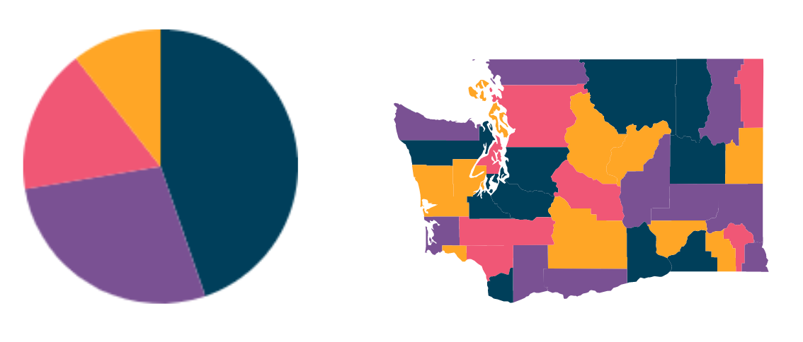
Stick with a limited color palette—usually up to four colors, with an accent on the primary color. Avoid high-contrast colors that can make a dashboard visualization harder to read. You can use services that help you pick the right palette, like this one.
Color contrast is key for better dashboard UX
It’s important not only to pick colors but also to match them correctly. Proper dashboard UX helps with readability and accessibility. Here is a handy tool to help you with that.
Beautiful dashboards respect negative space
Sometimes you have an urge to fill every single gap in your dashboard with an important number and/or graph. Negative space is crucial for dashboard UX—it helps users focus on insights rather than getting lost in noise.
Pick only essential content for your dashboards
Before building a dashboard, ask:
- What’s the goal of this dashboard?
- How will it be used?
Answering these will help you remove unnecessary elements and create a cleaner dashboard visualization.
Curious for more?: BI dashboard best practices
Focus only on the most important information to improve dashboard UX
Too much data can be overwhelming. Use color to highlight key KPIs, categories, or trends so users can spot insights fast. A well-structured dashboard should make important information easy to find at a glance.
Learn about filters
Remember the logic behind the colors on your dashboards
When you need to visualize change or prioritize information it is always a good idea to use simple and relevant colors: green for good/growth, yellow for watch-out/without changes, red for alert/drop.
Use natural reading patterns for better dashboard UX
Most people are used to explore information from left to right and from top to bottom. So when you decide how to place the information in the dashboard - use this simple rule: put the most important things on the top left and least important - on the bottom right.