‧
7 min read
How to build better line and bar charts
Alex Yarosh
‧ 7 min read
Share this article
Bar and line charts make up about 80% of what you’ll see in data visualizations. While building these charts in Metabase is straightforward and takes just 30 seconds, in this article, we’ll focus on the thought process behind building effective charts rather than how to create them.
We’ll go beyond the basics and explore how to improve your charts, the best practices for using different types of visualizations.
We’ve also had an entire webinar on this - check out the recording here (no registration required!).
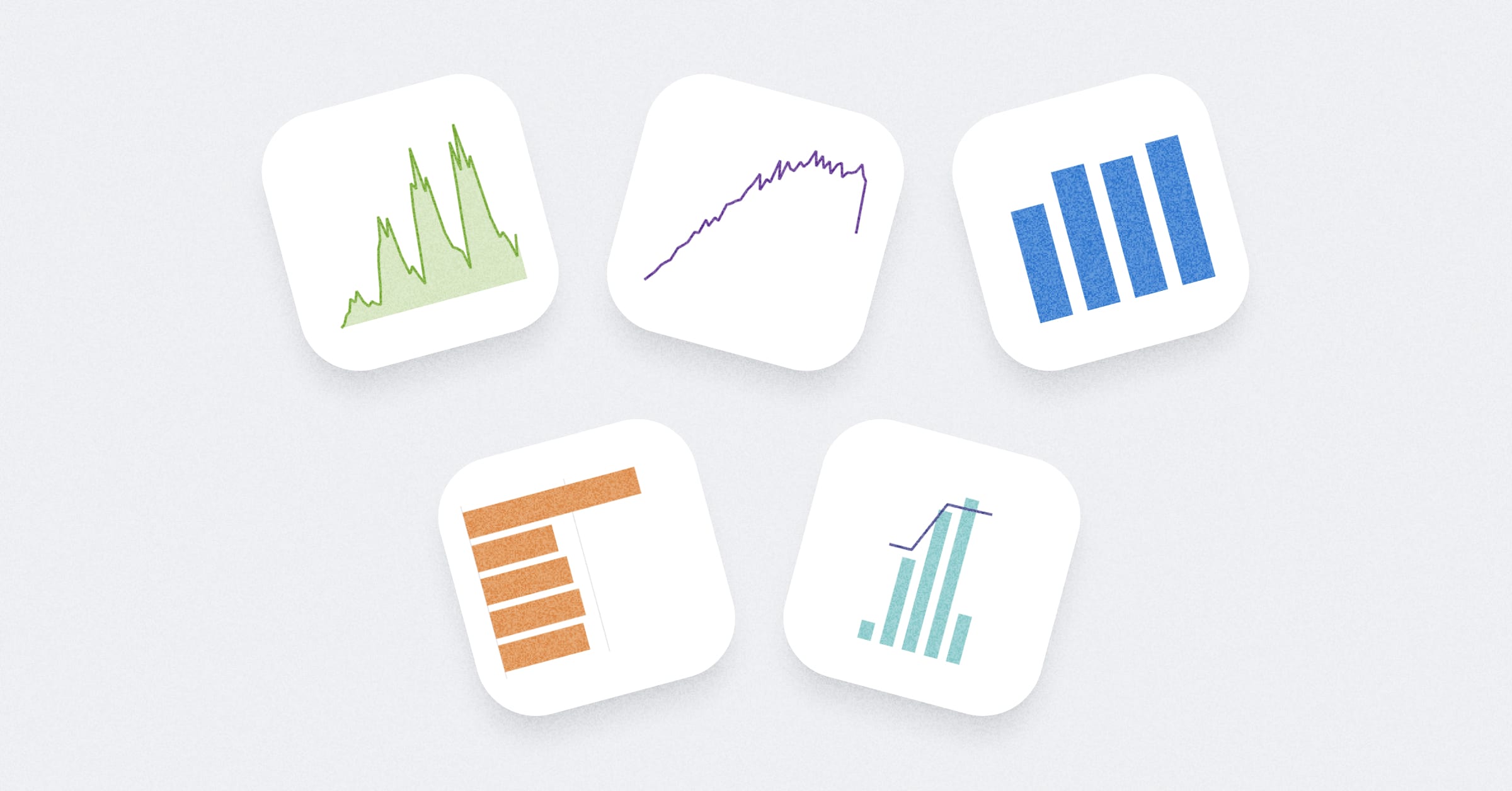
To start with, we’ve put together this handy cheat sheet which could refer to when visualizing your next thing. It covers 5 commonly used charts: line chart, bar chart, area chart, combo chart, and row chart.
How to choose the right chart type?
Choosing the right chart type is key to telling the right story with your data. These guidelines will help you choose between line, bar, and area charts.
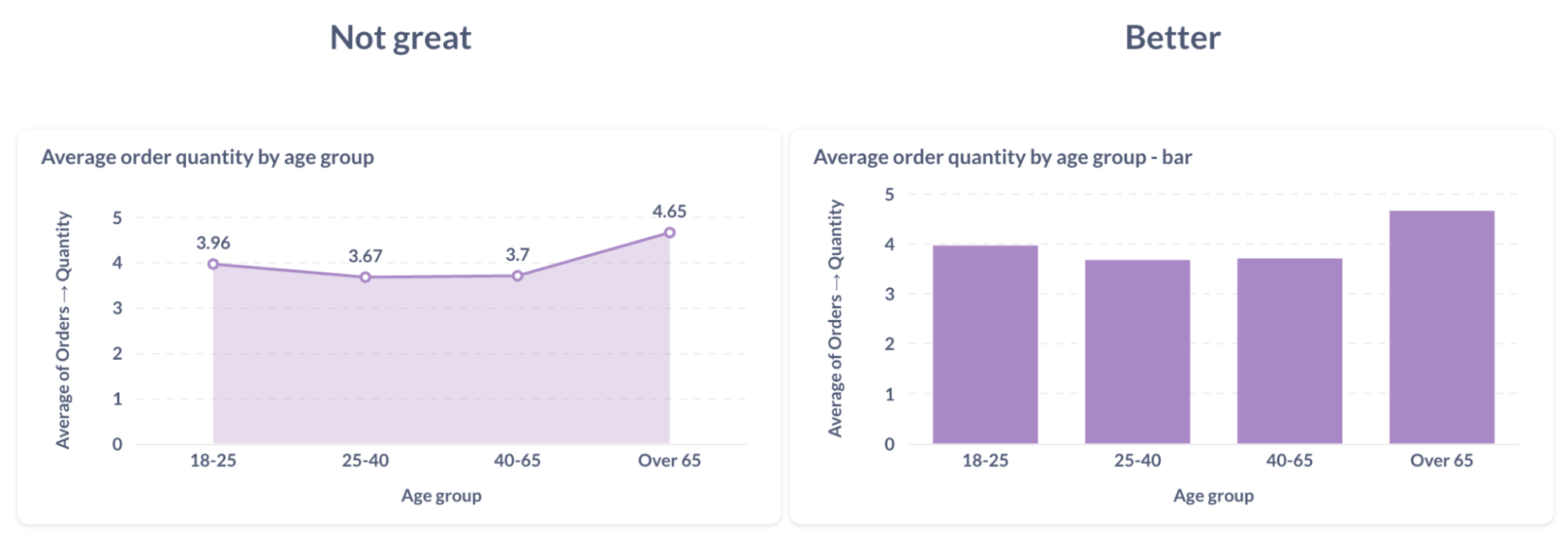
Use line and area charts for continuous data
Line and area charts work best when there’s a clear, continuous flow between data points—like tracking data over time. If your data points are just categories with no inherent connection between them, opt for something like a bar chart instead.
Leave trends for line charts, totals for bars
Line charts are perfect for showing how a metric changes over time, focusing on the trends. On the other hand, bar and area charts are better for emphasizing the size or total value of a metric at specific points. Use bars when you want to compare totals clearly.

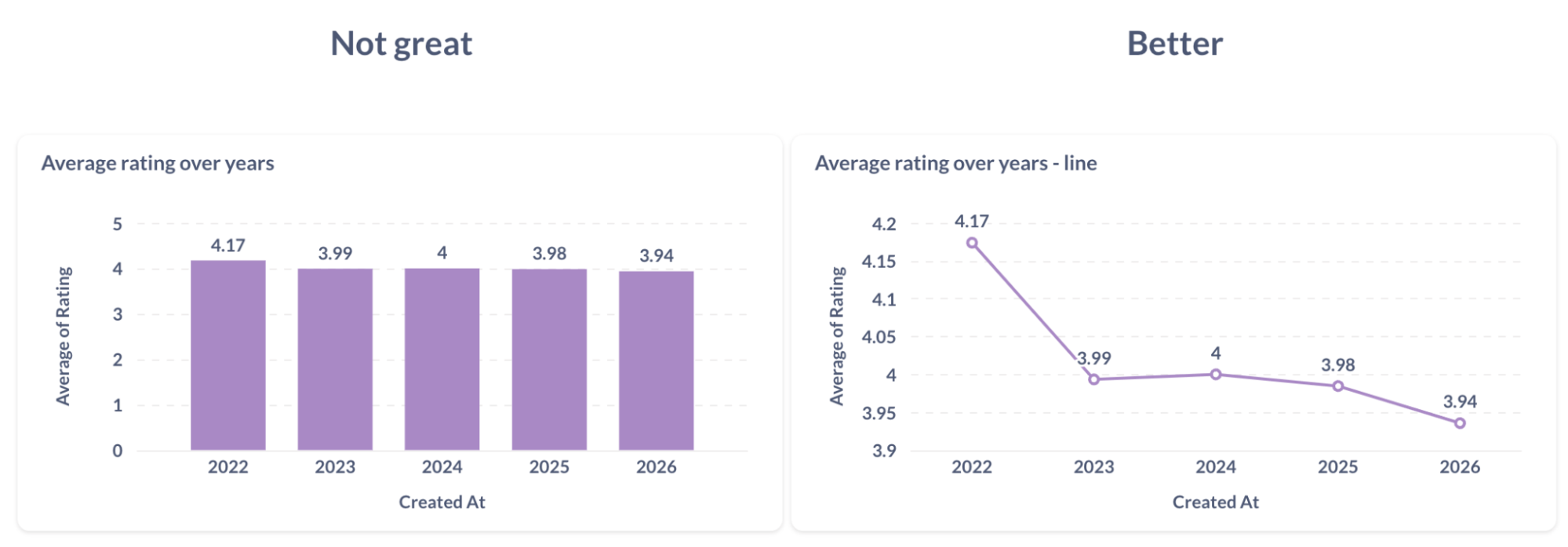
Use line charts for small changes
Bar and area charts suggest accumulation and work best when your metric relates to zero. But if your data shows only small fluctuations — like bouncing between 31 and 33 — using bars can be misleading. A line chart is more accurate for highlighting minor changes without overstating them.
How to improve your bar charts
Let’s take a bar chart as an example and try to improve it step by step.
Order your data
For bar charts, there’s often no natural order to the data. Sorting your bars from largest to smallest makes it easier to spot trends and understand the story your data is telling. Organized charts let people quickly see what’s important.

Show information where it’s needed
When reading bar or line charts, it’s frustrating to constantly check the Y-axis to figure out values. Instead, put the information directly on the chart — like displaying the value on top of each bar. This way, people can interpret your chart at a glance without unnecessary back-and-forth.

Keep bar charts simple
Focus on what’s necessary. Do viewers need to know there were exactly 1,494 homework assignments, or is it enough to show there were roughly twice as many assignments as quizzes? If exact numbers aren’t critical, simplify your chart. Reduce clutter by leaving out unnecessary labels or gridlines so your main message stands out.

Use natural reading patterns
People read charts the same way they read text—left to right, top to bottom. For English readers, a “Z” pattern is natural. A row chart might work better than a bar chart in some cases, as it aligns with this flow and makes your data easier to absorb.

Highlight what matters
What’s the goal of your chart? Should people focus on a specific number or trend? Use visual emphasis—like bolding key data points or changing color—to direct attention to the insights that matter most.

Use meaningful colors
Colors like green, red, and orange often come with implied meanings—green for positive, red for negative. If your chart reflects positive or negative outcomes, use these colors to help communicate those sentiments. But if your chart isn’t about sentiment, it’s best to avoid these colors to prevent unintended associations. You can also use color saturation to highlight important areas of your chart without overwhelming viewers.

Best practices for stacked charts
Stacked charts can add complexity to your data visualization, so it’s important to know when to use them and when to avoid them. Let’s break down the key considerations for using stacked charts effectively.
Stacking charts increases cognitive load
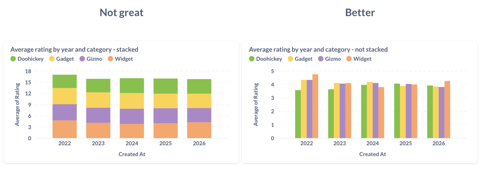
When you stack data, you’re adding an extra layer of complexity for viewers to process. Before choosing a stacked chart, ask yourself: are you trying to compare data within categories or across categories? Often, creating separate charts provides a clearer view of your data.
Stacking implies accumulation
Only stack metrics that make sense together—like totals or counts. Don’t stack metrics like averages or maximums that don’t naturally add up. For example, you can’t have an “average rating” of 12 out of 5. Use stacking only when the data logically accumulates.
Use line charts to show trends over time
Line charts are ideal for showing how metrics evolve over time, especially when tracking small changes. If you’re visualizing something like average ratings, a line chart will provide a clearer picture than a bar chart. To zoom in on small variations, you can unpin the Y-axis from zero—but never do this with bar or area charts, as it can distort the scale.
To make your line charts even clearer, reduce visual clutter by removing unnecessary data points. Use line thickness and color to emphasize the most important data series.
Dealing with categories of different sizes
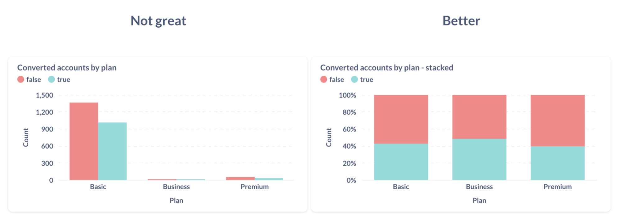
When categories in a chart have vastly different sizes, it’s tough to compare them. If your goal is to compare the proportion of categories within a bar, use a 100% stacked chart. But if you’re more interested in comparing raw sizes, rearrange the order of breakouts or use an unstacked chart.
Consider using row charts for a more natural reading order, especially if a custom order aligns better with the business context. You can also use color saturation and visual emphasis to highlight key benchmarks.
Even better:
- Row chart instead of a bar chart for natural reading order
- Custom order of bars that makes more business sense
- Visual emphasis on an important benchmark
- Color shade and saturation that communicate context
Challenges of comparing breakouts in stacked charts
Comparing breakouts in stacked charts can be difficult because comparing heights is easier than comparing areas. In a stacked chart, only the first (bottom) segment is easy to compare by height—anything above has to be judged by area, which is less precise.
Solutions:
- Use unstacked charts, but be mindful that they can get visually overwhelming.
- Consider stacked area charts, but keep in mind they can mislead depending on the data and context. Choose the right visualization based on the insight you’re trying to convey.
Be cautious with stacked area charts
Stacked area charts can easily distort the data because the order of the areas impacts how changes are perceived. It’s easy to overestimate or underestimate changes when the layers overlap. Remember, area charts are best for showing size, not changes or trends.
Conclusion
Now that you’ve got the basics down, head over to your Metabase account and try out these techniques to improve your data visualizations. See how they can make your charts more clear and useful. Happy charting!
More data visualization resources
- Webinar of bar & line charts visualization in Metabase
- Metabase guide to line charts
- Top 5 Dashboard fails (and how to fix them)
- Data visualization tips for the non-analyst
- How to visualize time-series data: best practices
- Maps data visualizations: best practices
- The perfect chart: choosing the right visualization for every scenario


