‧
4 min read
How to visualize time-series data: best practices
Alex Yarosh
‧ 4 min read
Share this article
Here’s a guide to best practices in time-series visualization, covering chart selection, data structure, and advanced techniques. We’ll skip the mechanics of creating charts, and focus on the principles behind building clear and impactful time-based visualizations,
This article includes stuff we covered in our webinar on visualizing time-series data.
We also made a time-series cheat sheet dashboard with everything we’ve discussed about time-series visualizations, from selecting the right chart type to structuring your data for comparison across time periods. Bookmark it and use it as a reference for your next time-series visualization.
What is time-series data?
Time-series data refers to a sequence of data points that include datetimes. Unlike other types of data, time series data is ordered chronologically, where each data point represents a specific moment in time, such as hourly, daily, or monthly measurements.
Examples of time-series data include stock prices, weather temperatures, sales figures, or economic indicators like GDP. These data points are typically grouped by a particular time granularity, like daily sales or weekly temperature readings.
Types of time-series visualizations
Charts for visualizing time-series data include:
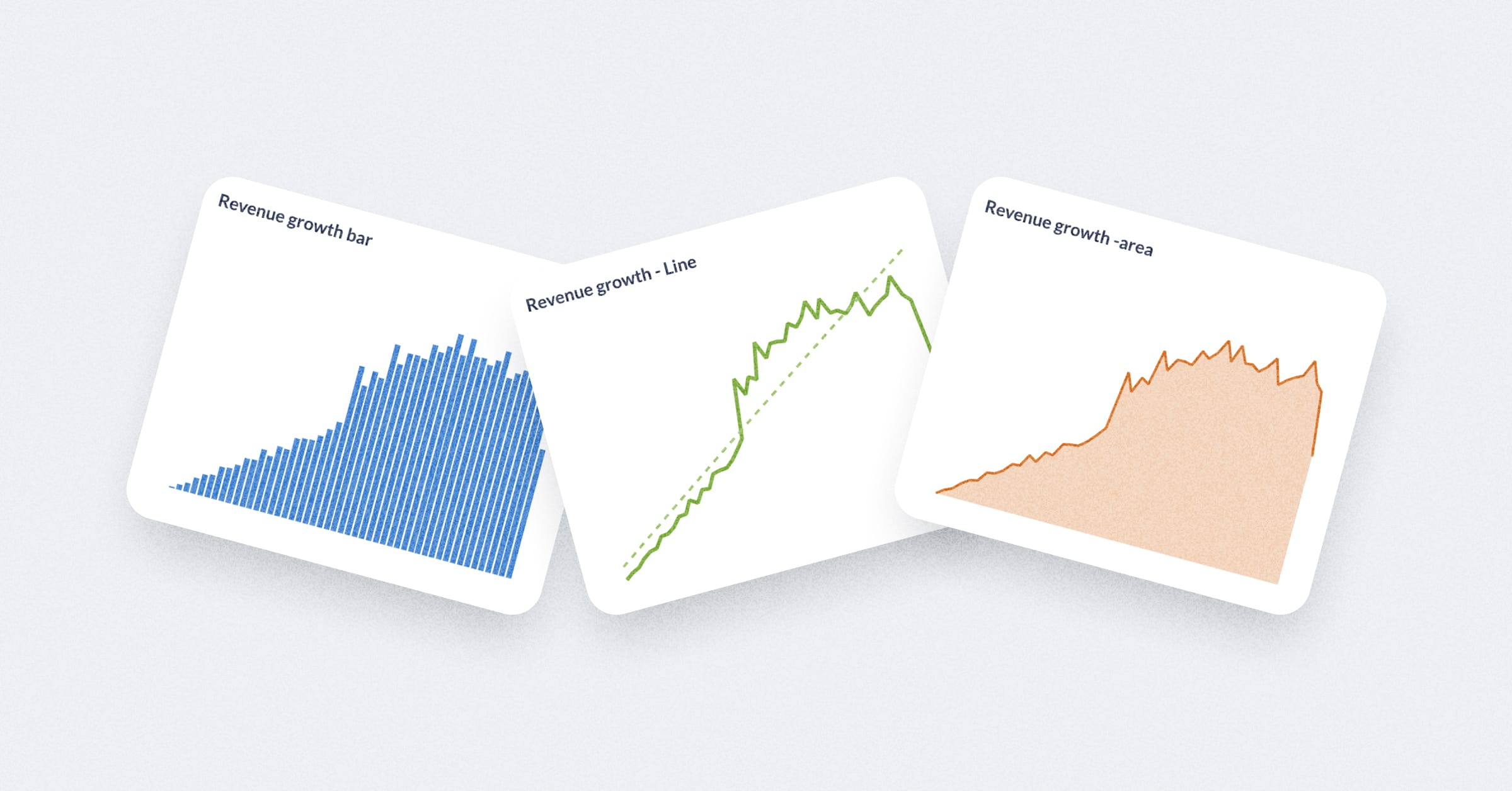
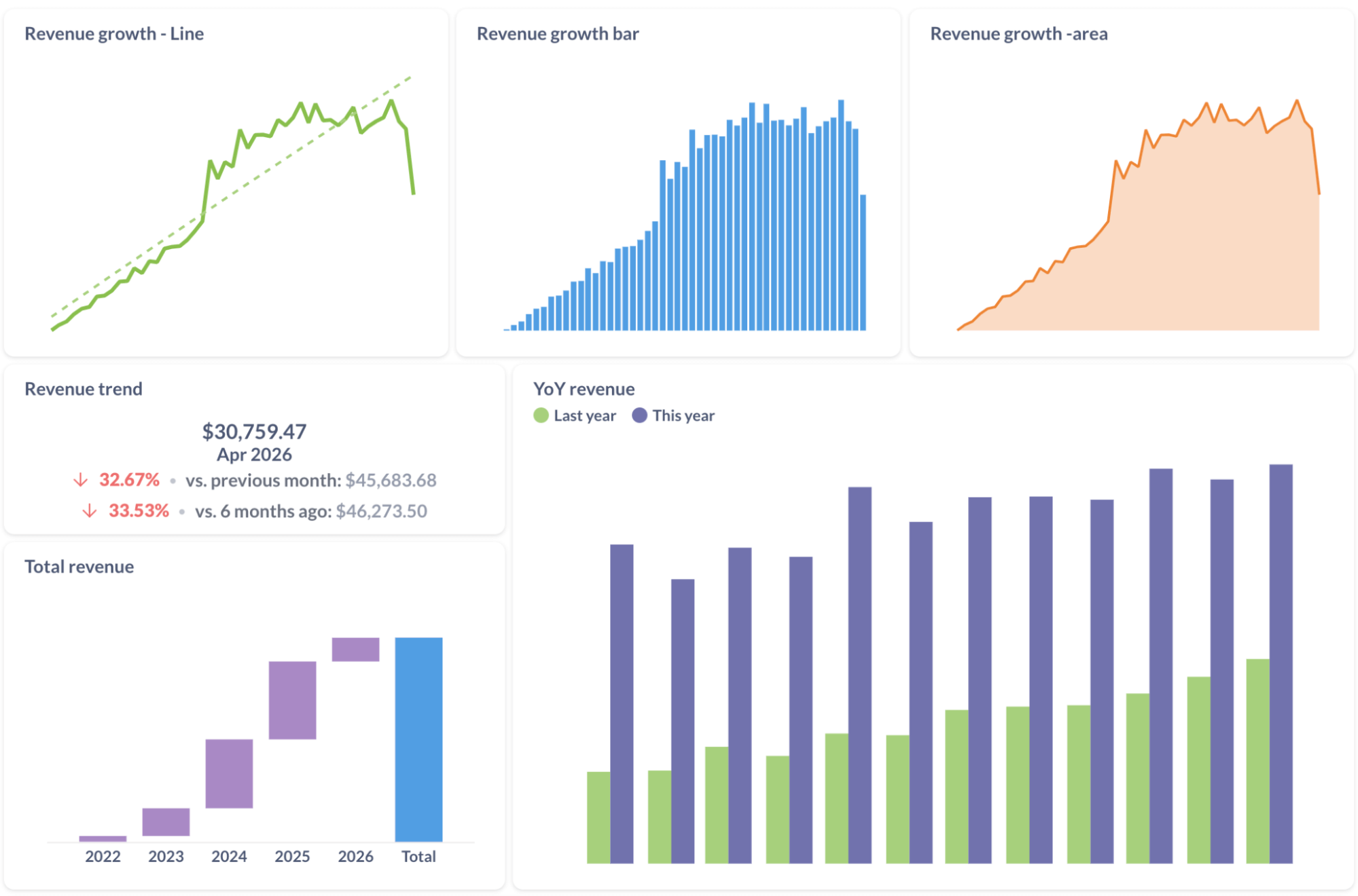
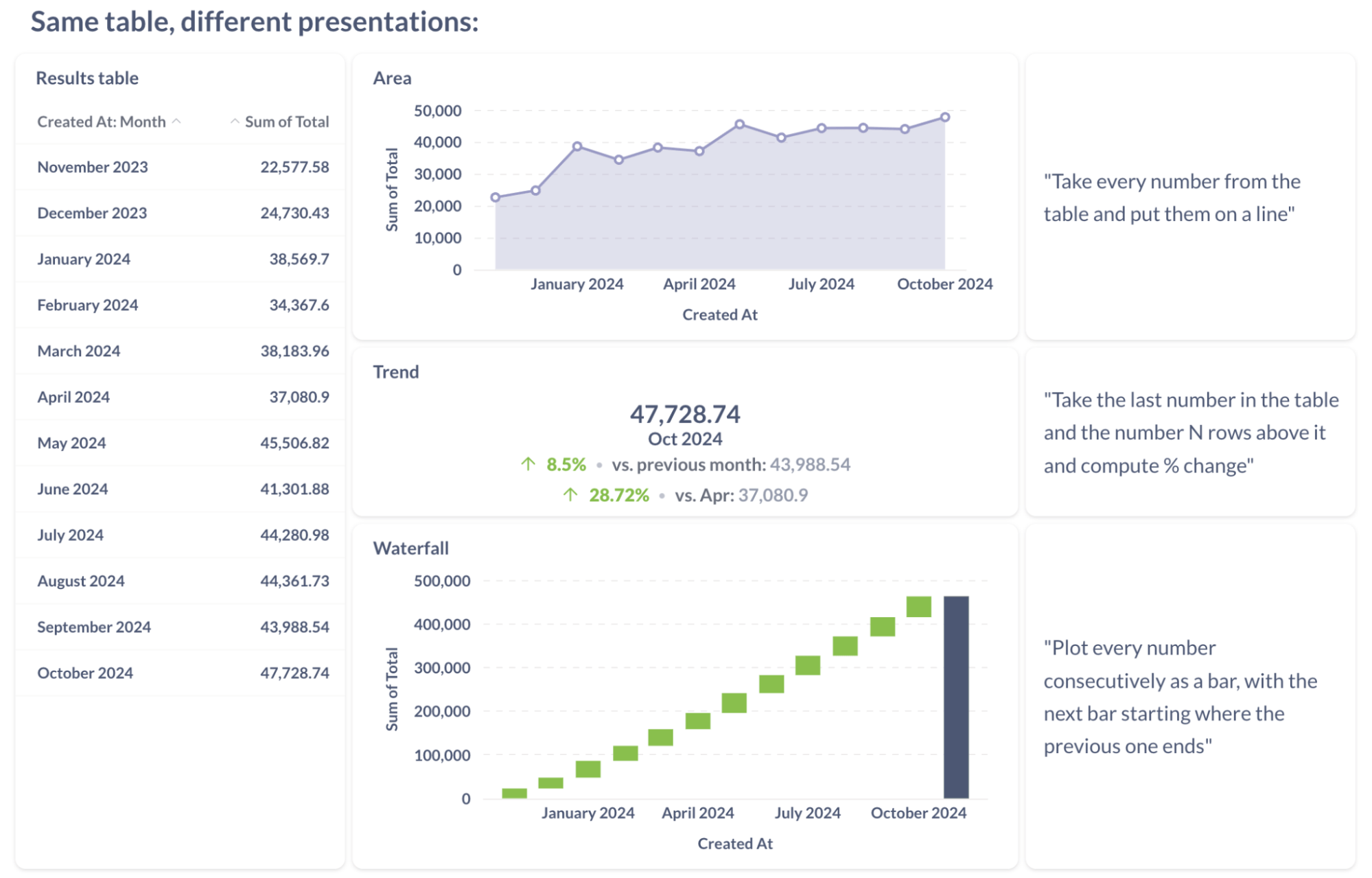
- Line Charts track trends or data progression over time.
- Bar Charts compare values across time intervals, especially for discrete data points.
- Area Charts illustrate cumulative totals over time.
- Trend Charts analyze performance changes by comparing values to previous periods.
- Waterfall Charts display sequential changes, though they’re more niche in application.
Best practices for time-series charts
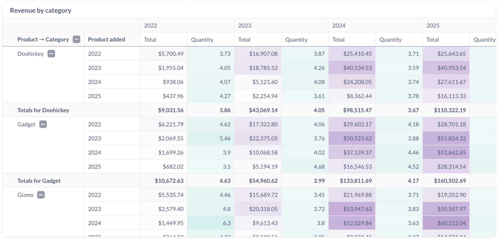
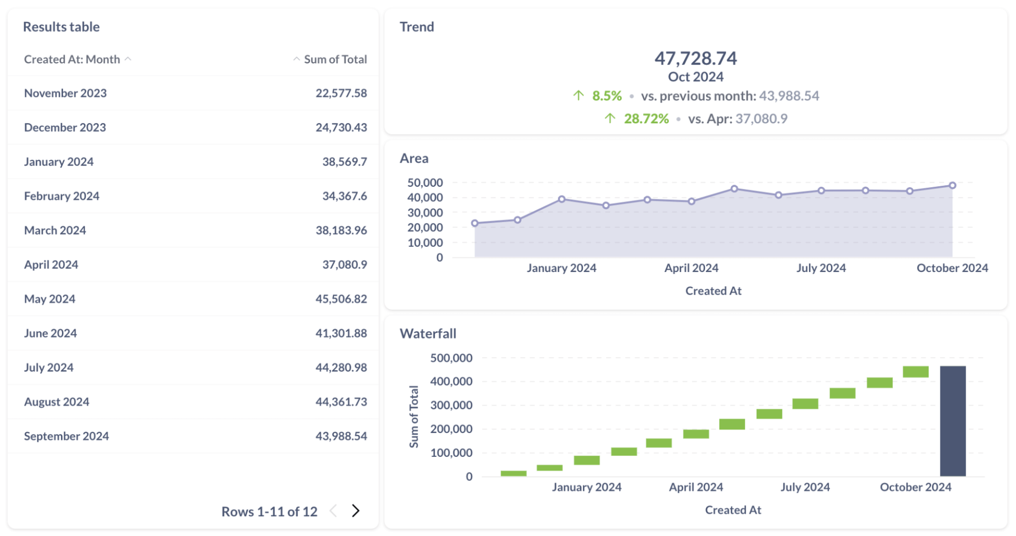
Focus on a single message: Each chart should communicate one key insight. For multiple insights, use separate visualizations. Different charts highlight different parts of your data, so start by structuring the results table to match your goal.
Consider:
-
“How should the results look for this chart?” For comparisons, include values for current, last week, and last month in your table.
-
“How do I control which month shows in a trend?” Make sure the target month is at the top of the table.
Consider data shape: Data structure informs the best chart type.
One metric over time
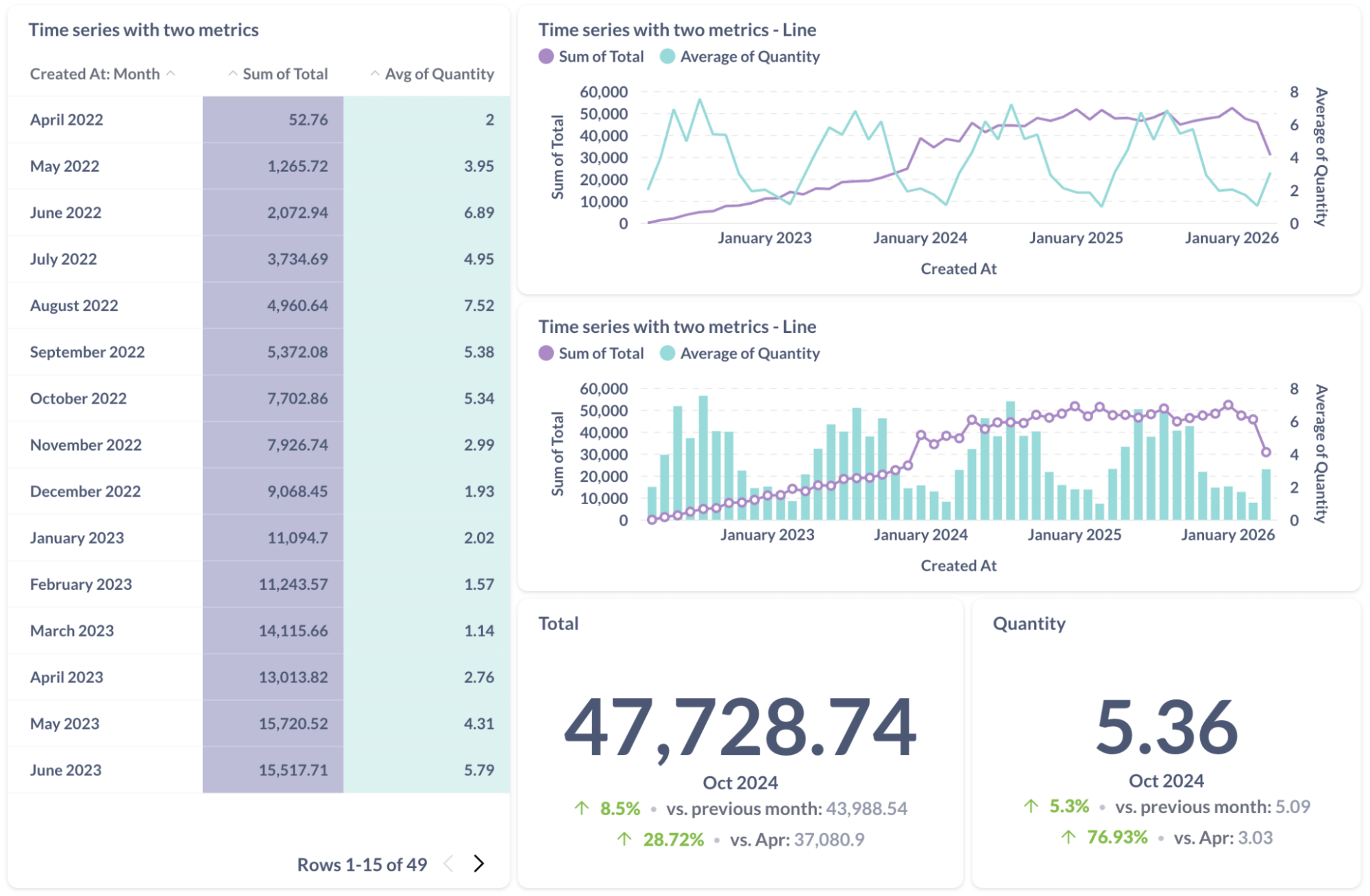
Multiple metrics over time
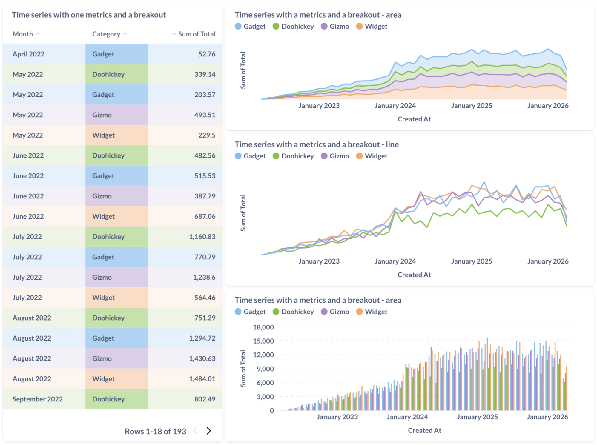
One metric with a breakout
Different charts emphasize different aspects of data, so pick the right chart for the aspect that you want to communicate.
Current state
Evolution
Magnitude
Proportion
-
Area charts (and bar charts) work better for showing size instead of trend.
-
Stacked area charts can be used to show how the shares of a metric’s breakouts change over time.
-
Don’t make conclusions about change in the metric itself from stacked area charts - they can be misleading! Stacked bar charts are only meant to show the change in proportions of the metric’s breakouts.
Accumulation
Use Offset for comparisons: The offset function in Metabase allows you to compare a metric’s value in the current row to its value in a previous row. For example, if you’re grouping by month, setting the offset to -12 will show the metric’s value from 12 months prior. You can use Offset to add columns to a row that include values from previous rows, which makes it easier to compare metrics like year-over-year changes in a single chart.

Now that you’ve got the basics down, it’s time to get hands-on and start building your own time-series charts with Metabase. Go ahead, create something awesome, and share it with the community!
More data visualization resources
- Top 5 Dashboard fails (and how to fix them)
- Time-series visualizations cheat sheet
- Video - Visualizing time-series data in Metabase
- Data visualization tips for the non-analyst
- How to build better line and bar charts
- Maps data visualizations: best practices
- The perfect chart: choosing the right visualization for every scenario


