Bar chart
Also known as
Bar graph
Column chart
What is a bar chart?
A bar chart is data visualization that uses rectangles (or bars) along axes that are proportional in size to the values being measured. These bars are scaled to the values associated with discrete, categorical data.
Bar charts are useful when you want to compare fixed values across categories. One axis will contain the categories being measured, while the other will show their corresponding numerical values.

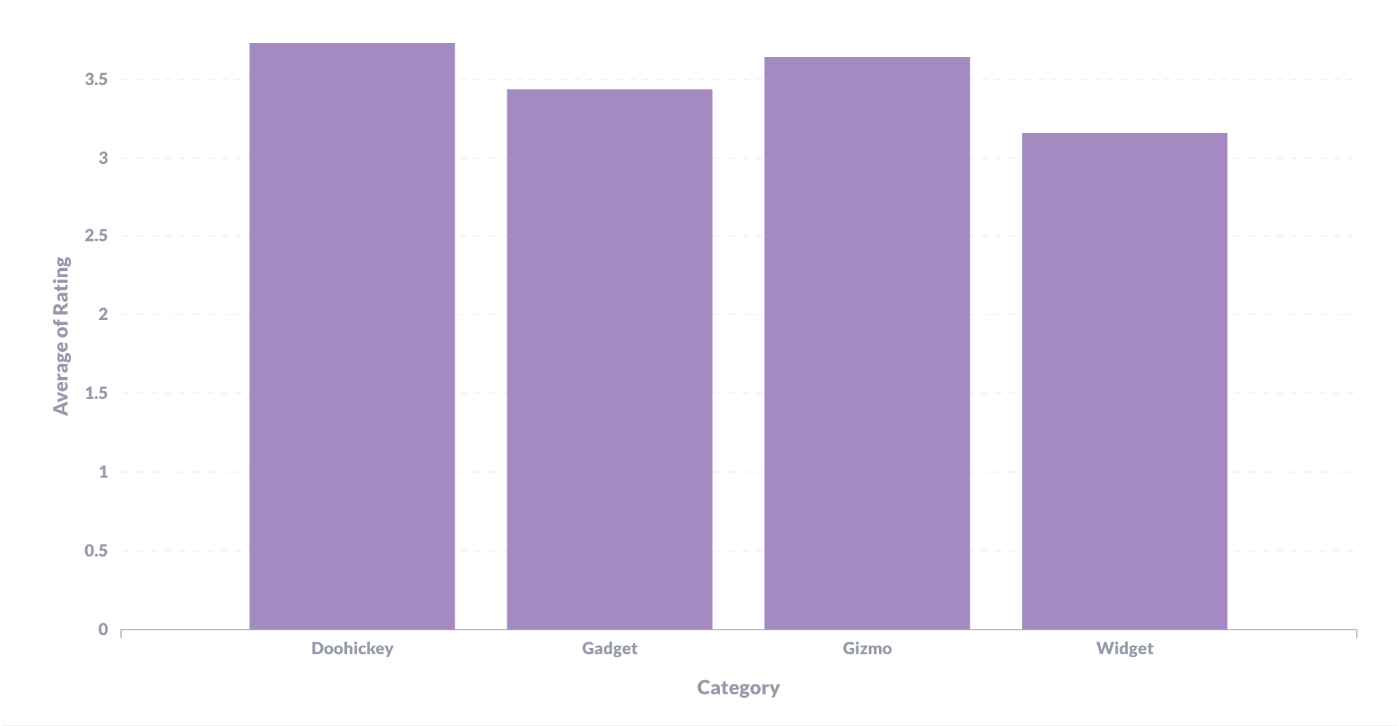
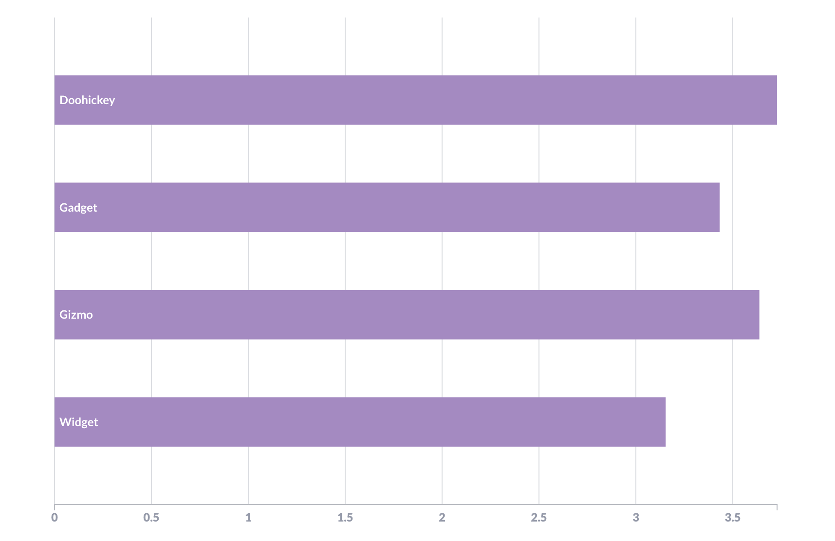
Figure 1 shows a standard column chart where the bars are displayed vertically, but you can also visualize your data with horizontal bars, known as a row chart. Figure 2 displays that same data — average product rating by category — in a row chart.

You aren’t limited to a single dimension with bar charts; they can be great for multi-series charting. For example, maybe you want to compare how orders performed by quarter based on user source. In this scenario, you could use a standard multi-series bar chart or a stacked bar chart, where user sources are stacked proportional to their values within a single bar, each bar displaying data from one quarter. And if you’d rather see those as relative percentages of within their stacks, consider a 100% stacked bar chart.
Bar charts are widely adopted and easy to interpret, making them a good option for quick-reference comparisons.


