Best practices for visualizing time series
Tell a story by organizing time series charts on the same dashboard.
We’re going to look at different strategies for comparing a metric between two different periods of time, like comparing this week to last week, or last year versus the previous. We’ll use the Sample Database included with Metabase so you can follow along. This Sample Database includes order information for a completely real, not-at-all-made-up company that existed from 2015 to 2020. And for flexing our query builder skills, we’re interested in how the orders placed in 2018 compare with those in 2019.
This article builds on a previous article on Time series comparisons, but here we’re covering two different strategies:
- Comparing time periods side by side on a dashboard
- Tips for side-by-side comparisons
- Overlaying two time series on the same chart
- Using custom expressions to compare last week to the previous week
- Further reading
Comparing time periods side by side on a dashboard
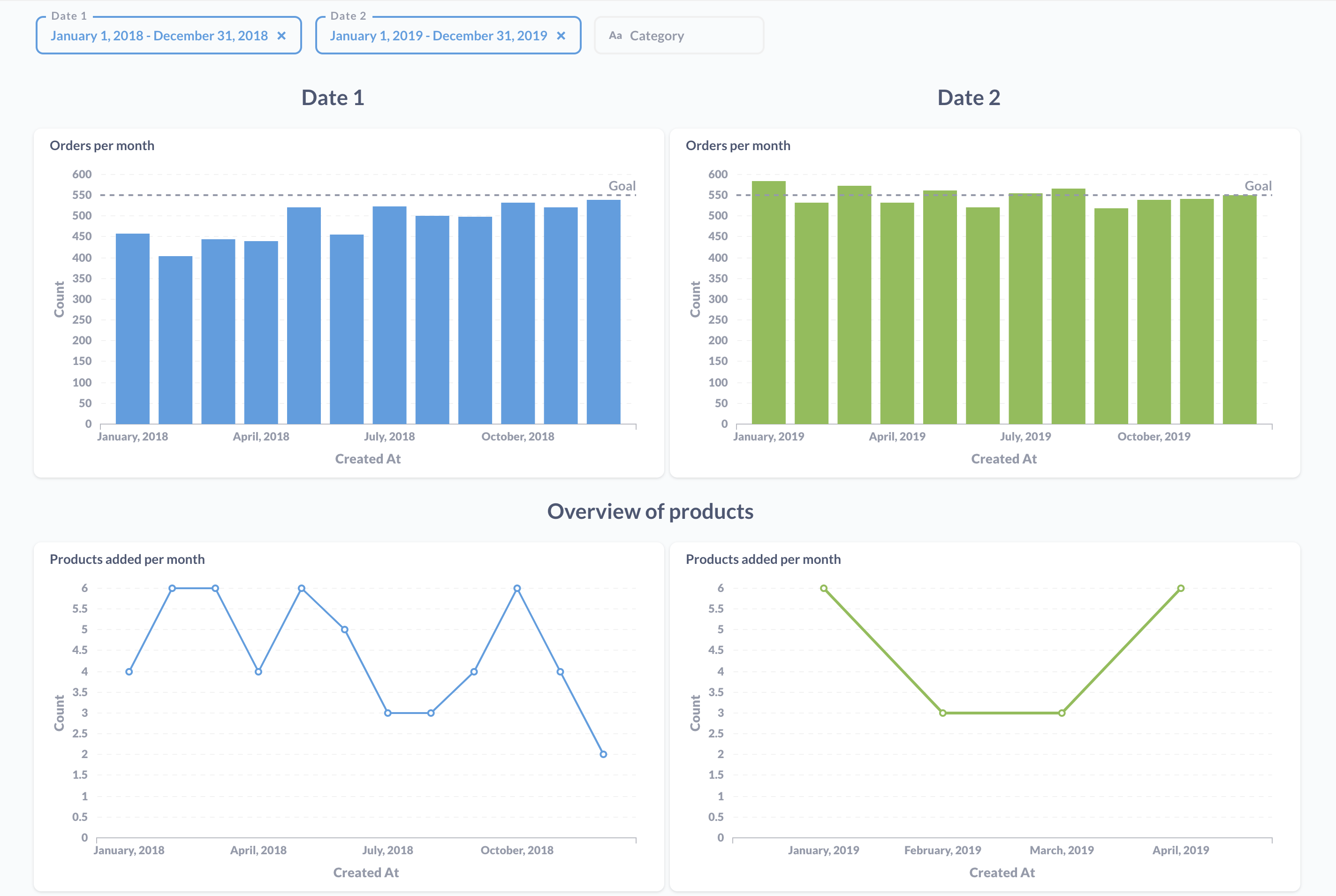
This pattern is easy to maintain and easy to extend (either by modifying cards or adding new cards), and it’s especially useful when you want to compare multiple metrics.
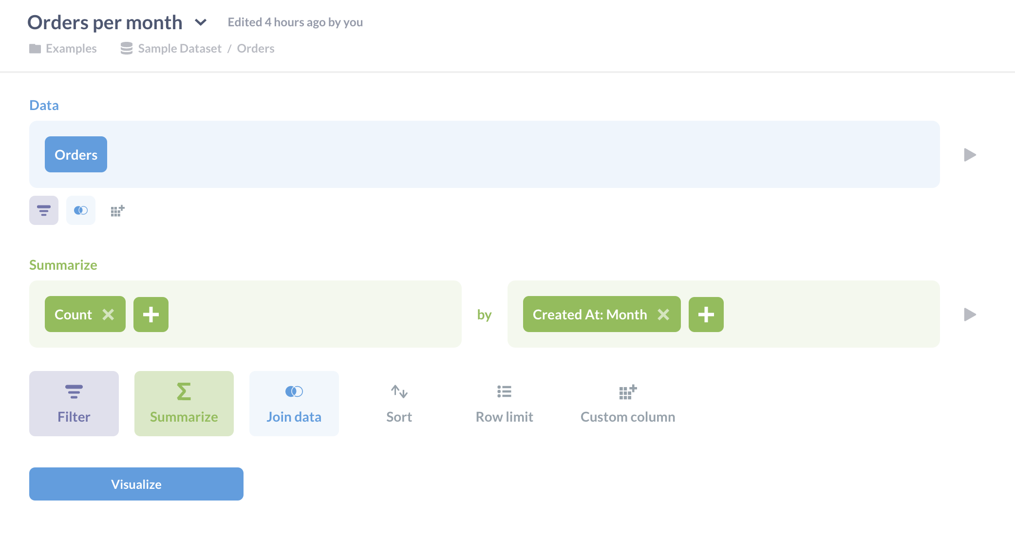
The first step here is to ask a question. For our data, we’ll select the Orders table. We’ll summarize the count of orders, and group by month. Then we’ll save the question as “Orders per month”.
Next, we’ll add our “Orders per month” question to a new dashboard, and call that dashboard “Side-by-side comparison”, or whatever. We’ll then add that same question, “Orders per month”, to the dashboard again (that is, as a second card), which we’ll place to the right of the original question.
What we’re doing here is creating two columns in our dashboard: the left column will have one date range, and the right column will have a second date range. We’ll attach a filter to control the date range for cards the left column, and another filter that will control the date range for the right column.
We’ll set default date ranges using the “Between” option for each filter (you can type out the dates instead of clicking through the calendar).
- Date 1 range:
01/01/2018to12/31/2018 - Date 2 range:
01/01/2019to12/31/2019
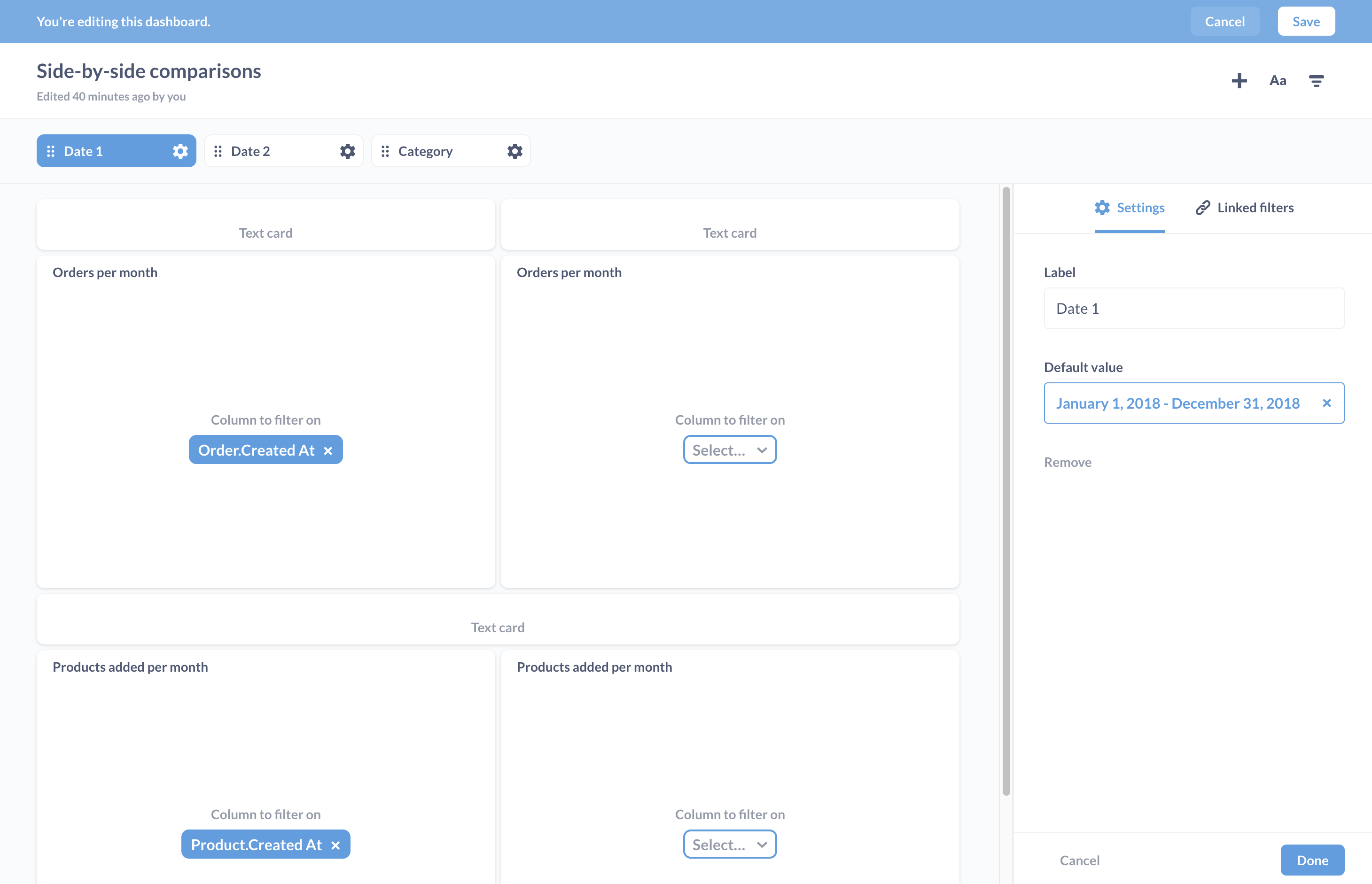
Save your changes, and refresh the page to update the results. We can also attach additional filters to the dashboard that we can wire up to cards in both columns, for example if we want to filter orders by a certain category.
You can add additional cards with time series, and wire them up to the corresponding filter for that column.
Tips for side-by-side comparisons
Keep in mind that this pattern breaks down when viewed a phone, as Metabase will collapse each card into a single column. You can still make sense of the dashboard, but it requires you to look closely at the dates for each card.
Use the same question for each column
That way if you want to modify the question, you only need to update one question, and both columns will get the update.
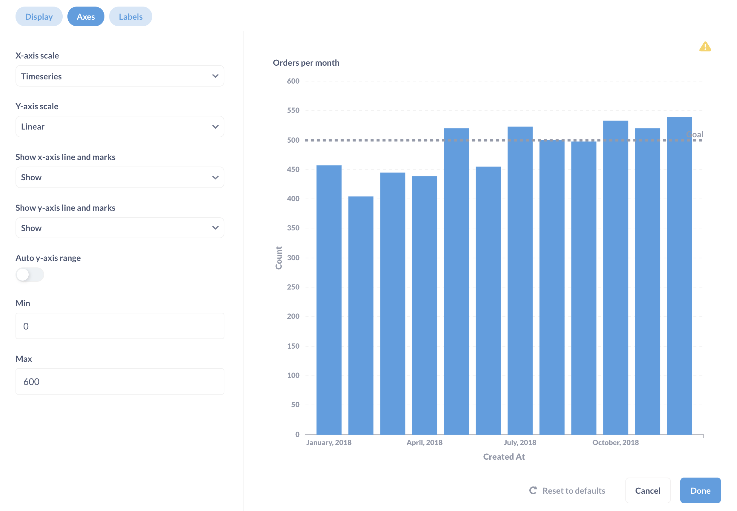
Make sure the axes are the same across the two cards
Metabase defaults to auto-adjusting the y-axis to account for the values, but it can make it hard to see the difference between two cards if one card tops out at 500, and the other at 1000. While in dashboard edit mode, hover over a card and click on the palette icon to edit the visualization settings. Click on the Axes tab, turn off the Auto y-axis range and set the y-axis Max (you should leave the Min as 0).
Using a goal line and/or trend line
Adding lines can make it easier for people to differentiate metric performance across charts. It’s clear that orders in 2019 exceeded the goal more often than in 2018.
Add text cards to group related cards
To make it easier for people to understand the split setup, we can add text cards that signal that each column corresponds to one of the filters: the left column to Date 1 and the right column to Date 2. When in dashboard edit mode, you can edit the visualization settings for the text cards by hovering over the card and clicking on the Palette icon. For example, for the card with ## Date 1, we’ve set the Vertical alignment to “Top”, the Horizontal alignnment to “Center”, and toggled off the Show background setting.
Use colors to distinguish columns
You can use different colors to distinguish cards in each column. Hover over a card and click on the Palette icon to update the card’s visualization settings.
For more tips on dashboards, check out BI dashboard best practices.
Overlaying two time series on the same chart
Now on to a fundamentally different approach. Here we’re going to cover two patterns:
- Using a custom column to group static date ranges
- Using custom expressions to compare last week to the previous week
Using a custom column to group static date ranges
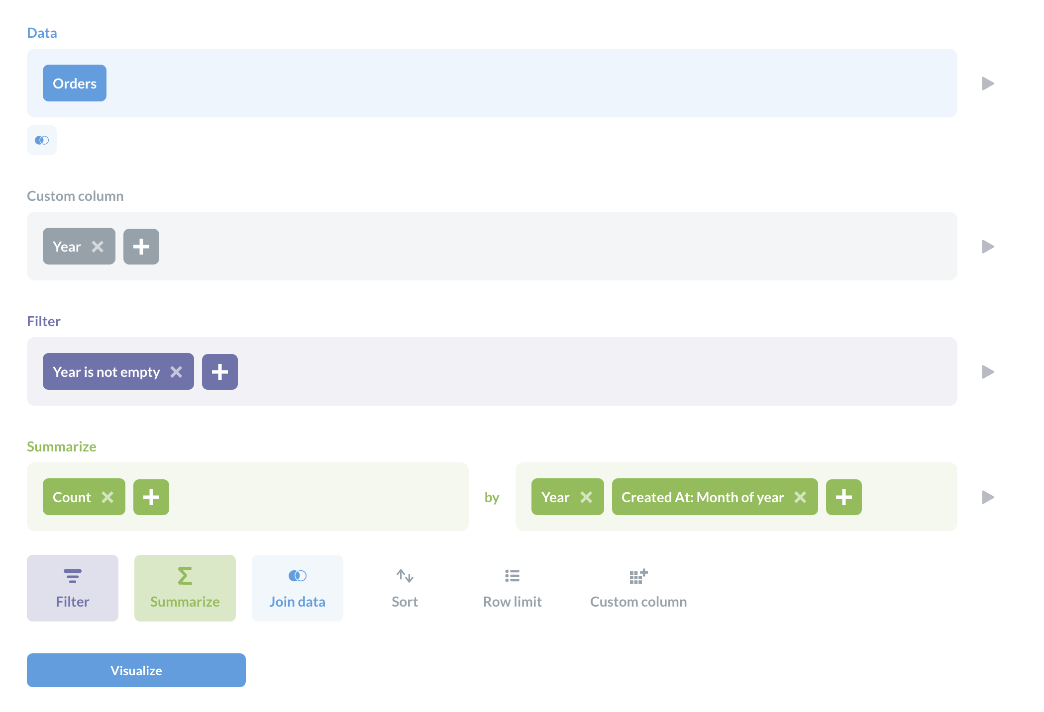
Here we’ll use a case statement to create a custom column. We can use the between expression. Here, we’ll create a new column using a custom expression.
case(between([Created At], "2018-01-01", "2018-12-31"), "2018", between([Created At], "2019-01-01", "2019-12-31"), "2019")
What this expression is saying is that for each record (row) in the results, add a new column. In the case that the Created At field is between January 1st of 2018 and December 31st of 2018, put the value “2018” in the Year column for that record. In the case that the Created At date falls between that 2019 range, put “2019” instead. Otherwise, leave it empty. Next, we want to filter for all the records where the “Year” column we created is not empty.
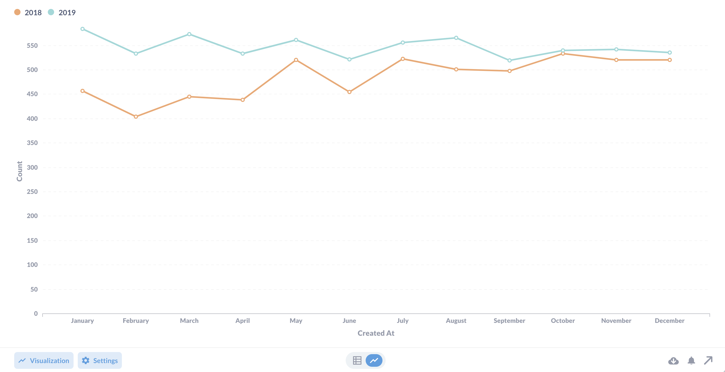
And here we have two time series, 2018 vs 2019, on the same chart:
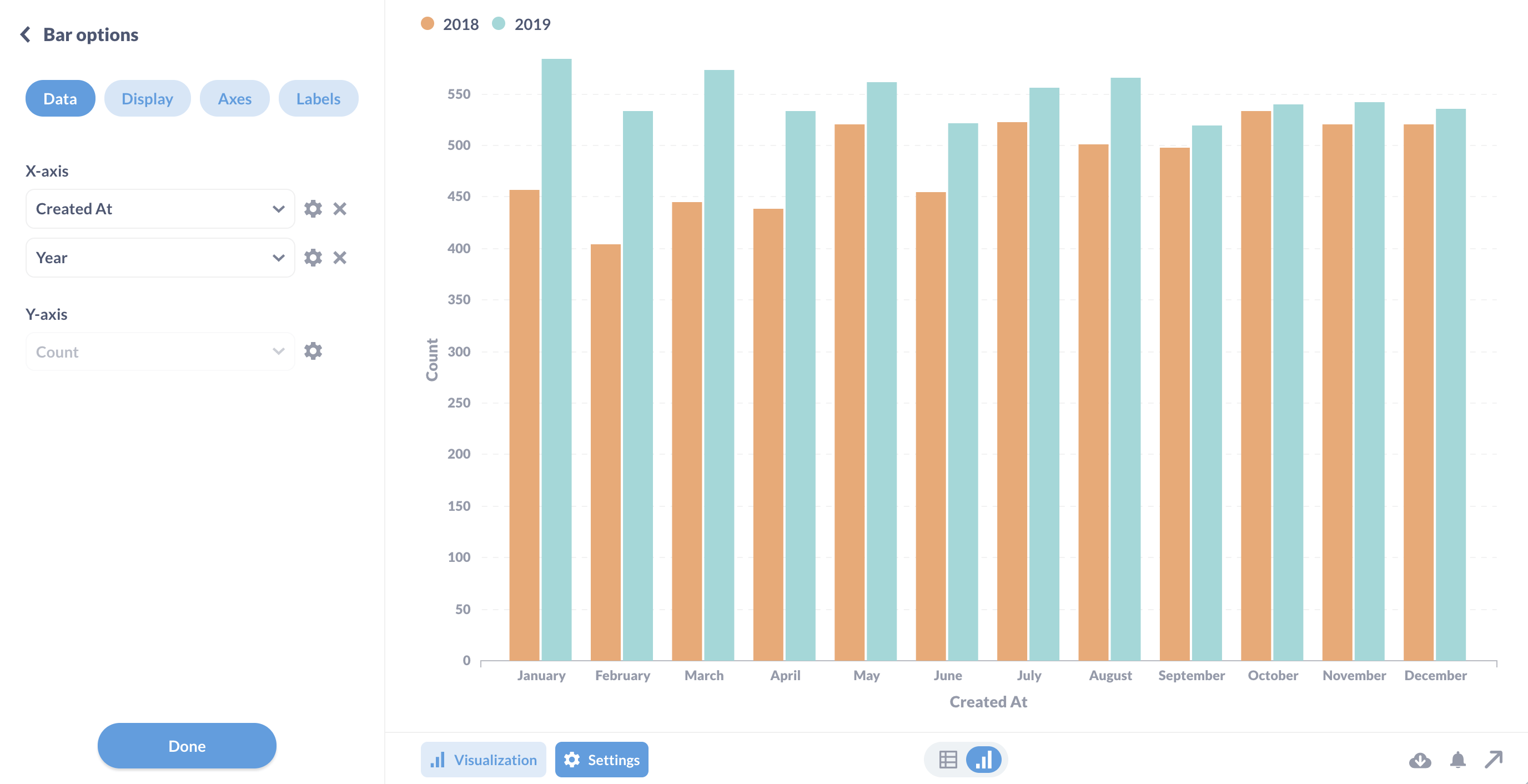
Which you could also visualize as a bar chart:
Now, if you want to compare dates relative to the current date, you can use the interval function in a case statement, but we’re going to cover a different use case for interval next.
Using custom expressions to compare last week to the previous week
We’ve covered one way to compare time periods in a previous article on Time series comparisons CountIf aggregation and the between function. This time we’re going to use the interval function, which lets us specify a duration relative to the current date.
The Sample Database only has data up until 2020 (not sure what happened to the company), so you’ll need to try this out on your own data, but here’s how it would work:
With the Orders table as our starting data, we’ll add two summaries (metrics). In the Summarize section, we’ll define one summary using a custom expression that we’ll name “Last week”:
CountIf(interval([Created At], -1, "week"))
In interval-speak, 0 means current week, so we write -1 to only count an order if the Created At for that row is a date from last week. We could also change “week” to “day”, “month”, “year”, or other intervals; check your database’s documentation to see which intervals it supports.
Next, we’ll define a second summary for “Previous week”.
CountIf(interval([Created At], -2, "week") AND NOT interval([Created At], -1, "week"))
Here we’re saying only count all orders from the previous two weeks except (AND NOT) the orders from last week.
Finally, we need to group the summaries. Since we want to see how last Monday performed against the previous Monday (and every other day of the week), we’ll want to group Created At by Day of week.
Further reading
- Time series comparisons
- Custom expressions in the query builder
- Dashboard filters
- BI dashboard best practices

