These are the docs for the Metabase master branch. Some features documented here may not yet be available in the current release. Check out the docs for the current stable version, Metabase v0.59.
Pie and sunburst charts
A pie chart can be used when breaking out a metric by a single dimension. In Metabase, pies are donuts. A sunburst chart is a multi-dimensional pie chart with multiple breakouts.

When to use a pie or sunburst chart
Pie charts can be used to visualize a metric as part of a whole. Sunburst charts can be used to visualize hierarchical or nested data, or display multiple levels of categorization.
Pie and sunburst charts work best when the number of possible breakout values is small, like accounts by plan. These charts should only be used to visualize metrics that add up to 100% (like count or sum of total).
Pie charts should be used to communicate a general sense of the relative sizes of breakouts. If precise comparison is important so people can see the exact differences between values, or you have more than a few breakouts (like customers per country), it’s usually better to use a bar or row chart.
How to create a pie or sunburst chart
Pie and sunburst charts display a single metric across one or more breakouts. Both pie/donut charts and sunburst charts are available in the “Pie chart” option in the visualization sidebar.
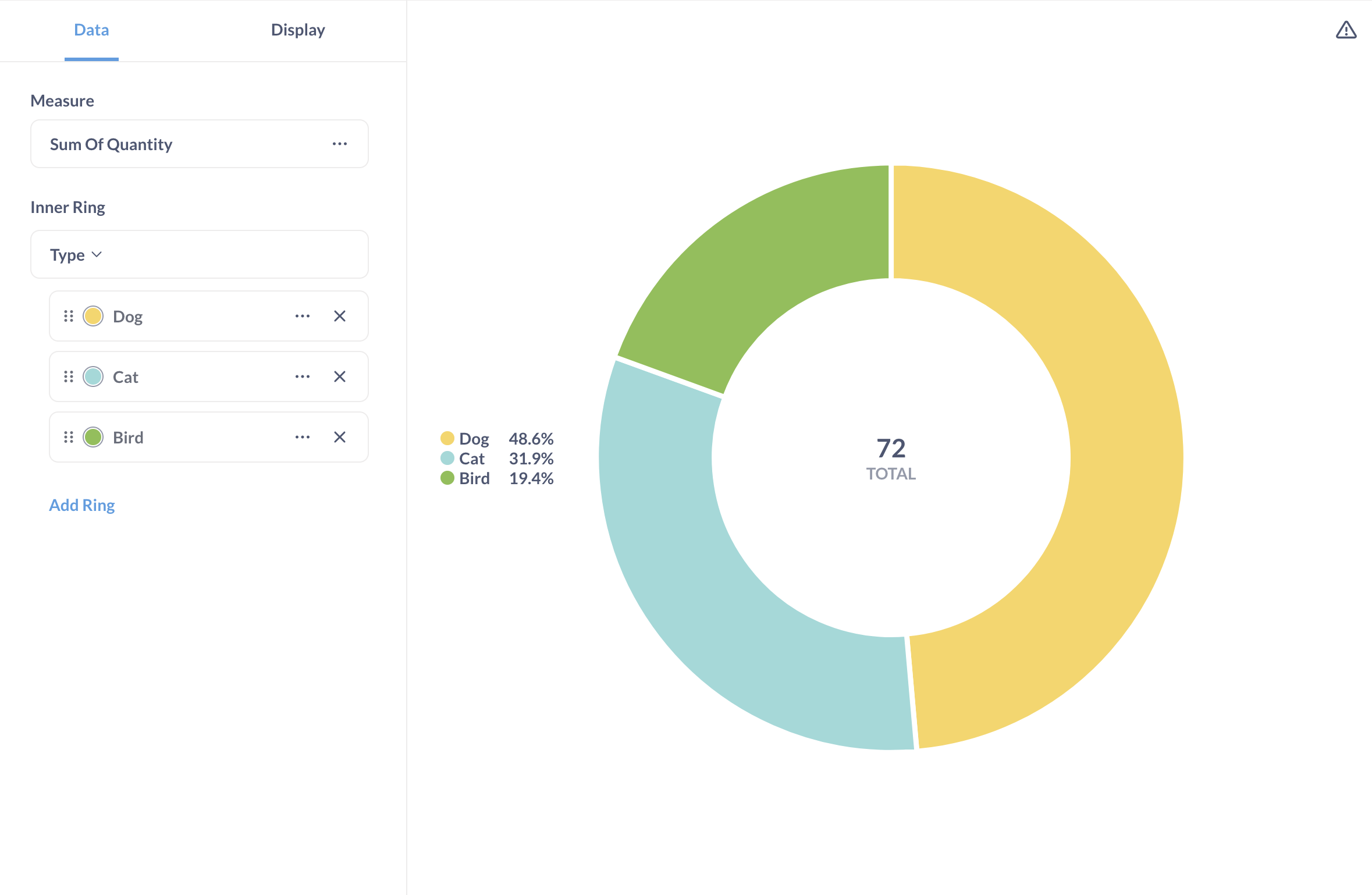
For a simple pie chart, you’ll need a query with a single breakout and metric, for example:
| Type | Sum of Quantity |
|---|---|
| Cat | 23 |
| Bird | 14 |
| Dog | 35 |
If your query has multiple metrics, you’ll be able to choose the metric for the chart in chart settings.
For a sunburst (multi-dimensional pie) chart, you’ll need a query with up to three breakouts and a numerical metric. Here’s an example of a query result with two breakouts, Type and Subtype:
| Type | Subtype | Sum of Quantity |
|---|---|---|
| Cat | Siamese | 4 |
| Cat | Persian | 12 |
| Cat | Bengal | 7 |
| Bird | Crow | 5 |
| Bird | Parrot | 9 |
| Dog | Corgi | 10 |
| Dog | Poodle | 13 |
| Dog | Bulldog | 7 |
| Dog | Husky | 5 |
You can choose which breakouts to assign to the inner, middle, or outer rings of the sunburst chart in chart “Data” settings. If your query has multiple metrics, you’ll also be able to choose which metric to display. Here’s the sunburst chart for the example table above:
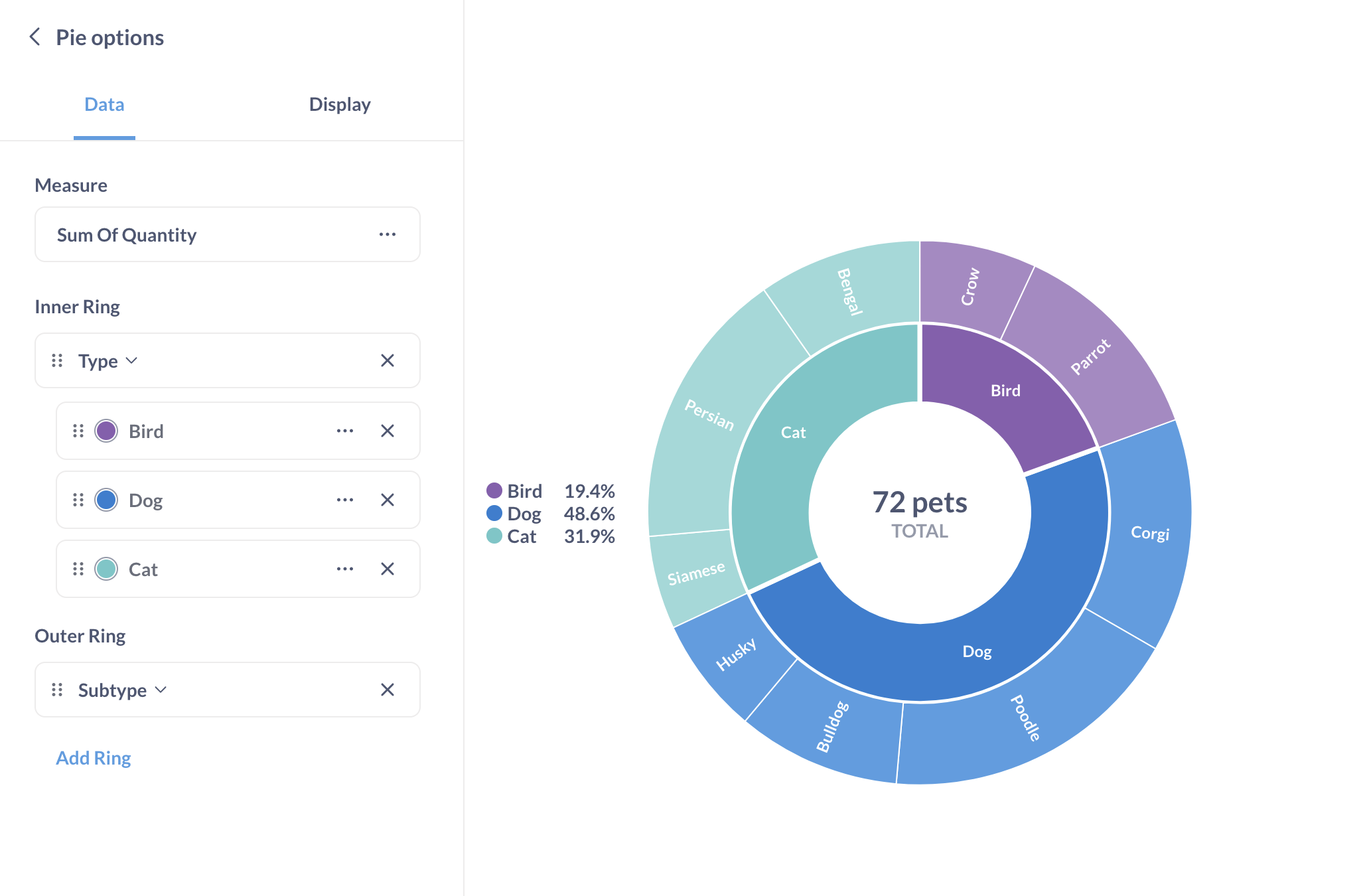
You don’t need to include the percentages in your query. Metabase will automatically compute the percentage of the total for each value of the metric (for example, Metabase will compute that 23 Cats make up 31.9% of all pets).
Pie and sunburst chart settings
To open the chart options, click on the gear icon at the bottom left of the screen. This will open a settings sidebar with Data and Display tabs.
Data settings
You can rename, reorder, or remove slices from the inner ring of a sunburst or pie chart. To reorder the pie slices, drag the cards with the slice names. To rename the slices, click on three dots next to the series name and enter a new name.
To change the color of the pie slices, click on the color circle next to the slice’s name. In sunburst charts, you can only change the color of the slices in the inner ring (the slices in the outer rings inherit the colors of their parent slices).
If your query has multiple metrics (columns), you can pick the column that should be depicted on the chart in the Measure dropdown.
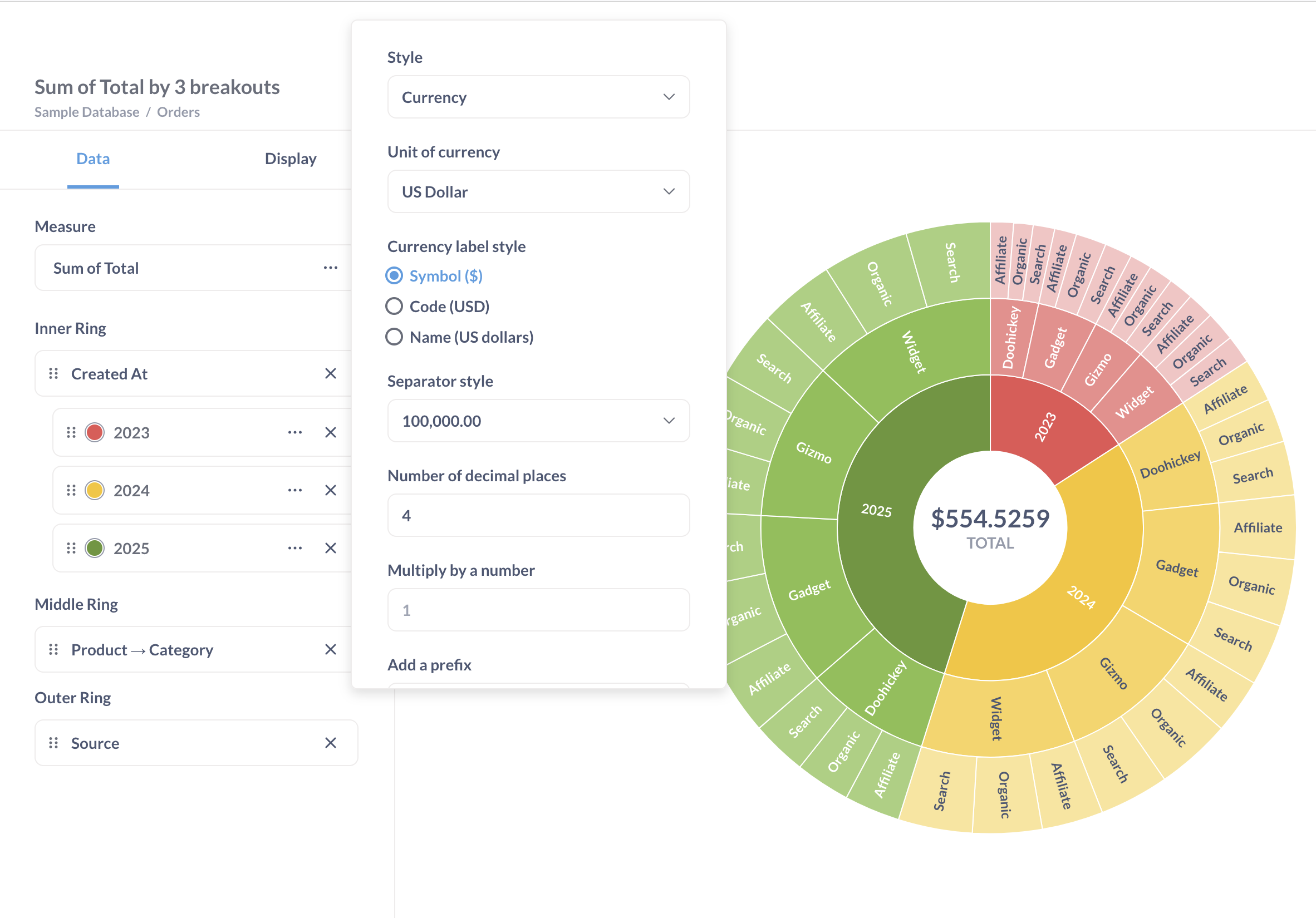
To format the total displayed in the middle of the chart, click on the three dots next to the metric name in the Measure setting. The measure format options — including the “number of decimal places” option — will only apply to the total, and not to the percentage values or labels. To configure the display of the percentage values and labels, go to the display settings tab.
Display settings
You can configure whether to show:
- The legend next to the chart.
- The total in the center of the chart. The format of the total can be changed in the data settings.
-
The labels for the pie slices. The labels for the inner ring slices can be changed in the data settings.
For sunburst charts with multiple breakouts, only the inner ring breakout will be displayed in the legend. By default, “Show labels” will be turned on. If you turn off “Show labels”, the only way to distinguish slices on a sunburst chart will be to hover over them.
-
The percentage values for the slices. If you choose to display percentages In the legend, but then toggle off Show legend, the percentage values won’t show up on the chart.
You can always see percentage values for any slice by hovering over the slice.
To change the number of decimal places in the percentage values, use the Number of decimal places setting in the Display tab. If you want to change the number of decimal places for the total in the center of the chart, go to data settings.
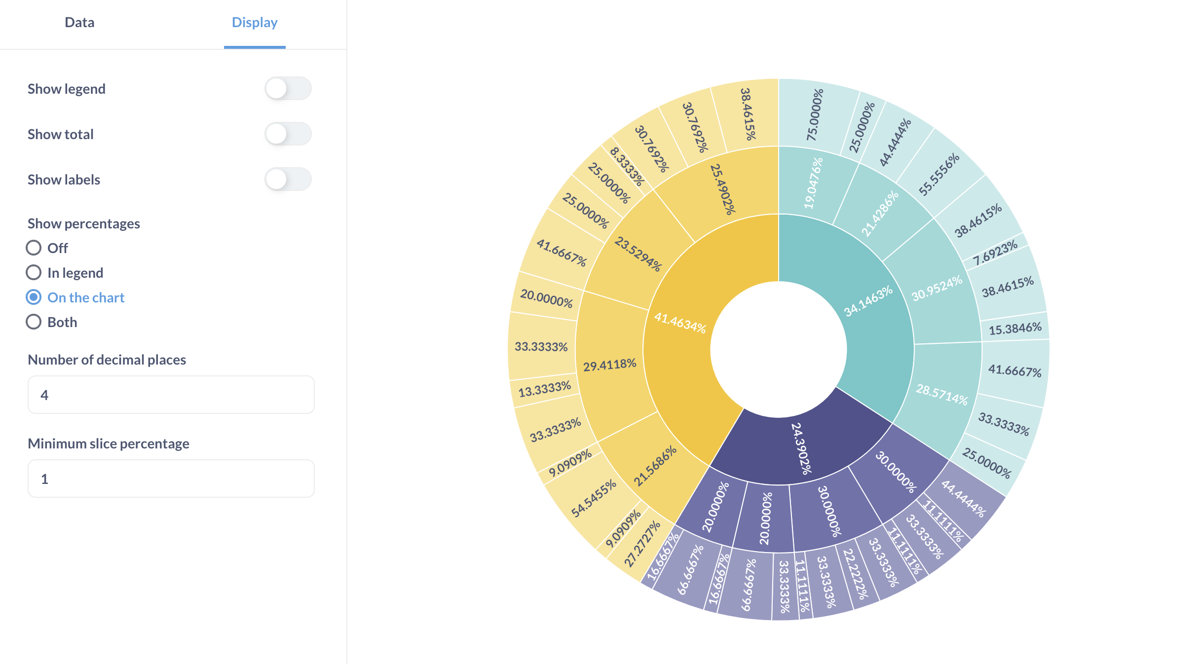
To make the chart more legible, you can group slices smaller than a certain percentage into one slice by adjusting Minimum slice percentage. You’ll be able to see the categories and values in the Other slice by hovering over it:
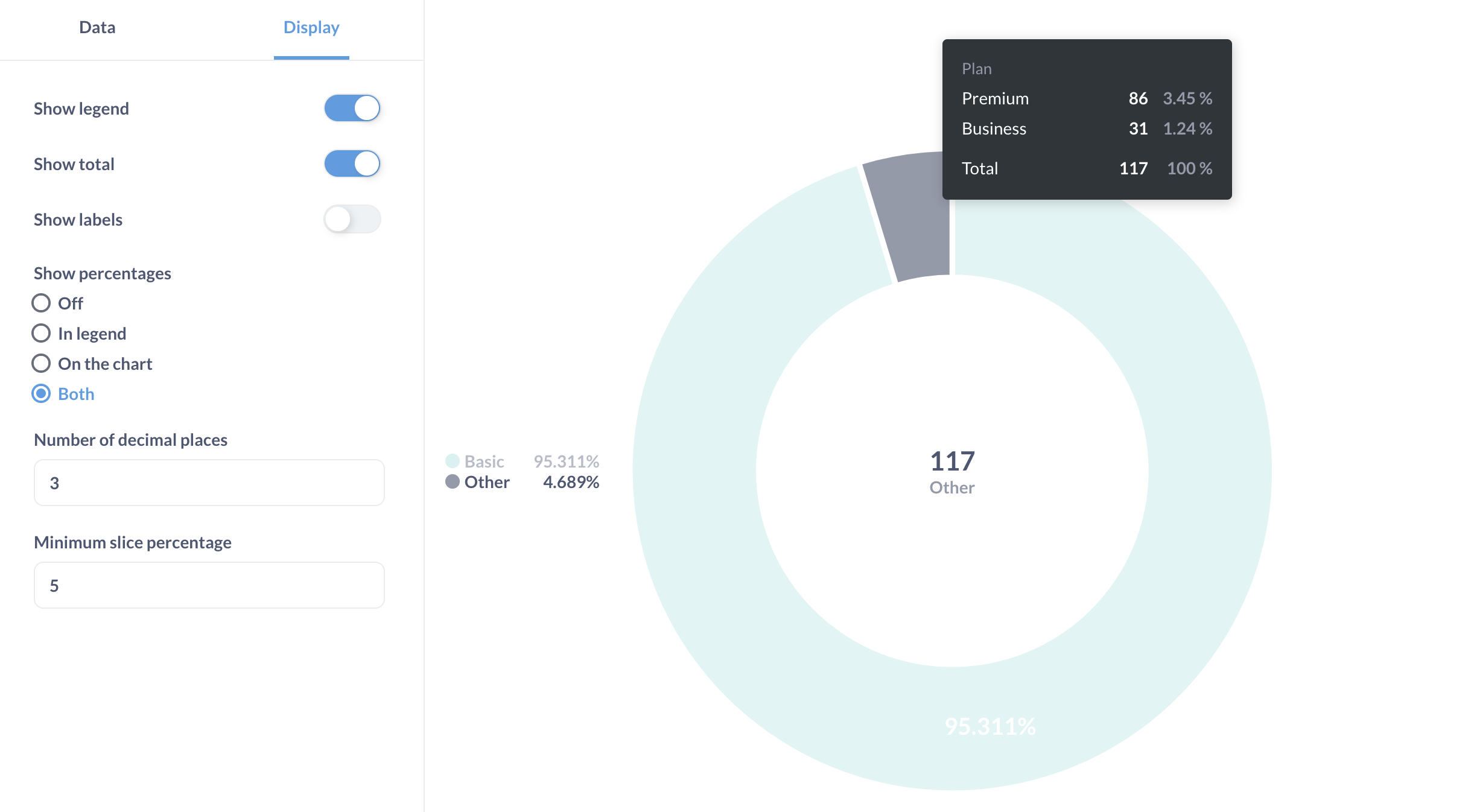
Currently, you can’t change the color or label of the Other slice.
Limitations and alternatives
Consider using a bar or row chart (or a stacked bar chart) or a pivot table instead of a pie or sunburst chart in the following cases:
- Your data has more than three breakouts
- Your metrics don’t add up to 100% (for example, average rating - prefer a gauge chart in that case)
- You have a lot of categories in each breakout
Read docs for other versions of Metabase.


