

These are the docs for the Metabase master branch. Some features documented here may not yet be available in the latest release. Check out the docs for the latest version, Metabase v0.54.
Visualization overview
While tables are useful for looking up information or finding specific numbers, it’s usually easier to see trends and make sense of data using charts.
Visualize query results
The query builder will automatically select an appropriate chart to visual your results. With native queries, however, you’ll need to manually select a chart type.
Visualizing questions in the query builder
To visualize results of a question built in the query builder, click on the Visualize button under the last query builder step. Metabase will select a chart type most appropriate for your data, but you can change the visualization type. You can also toggle between the visualization and the table of results.
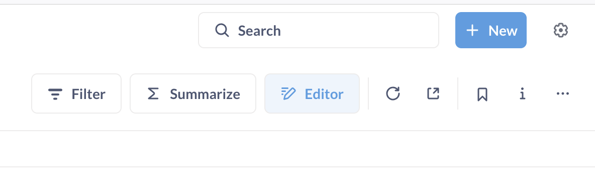
You can switch between the visualization view and the query builder using the Visualization/Editor button in the top right.
Visualizing native questions
To visualize results of a native query, click on the Visualization button in the bottom of the screen and select a visualization type.
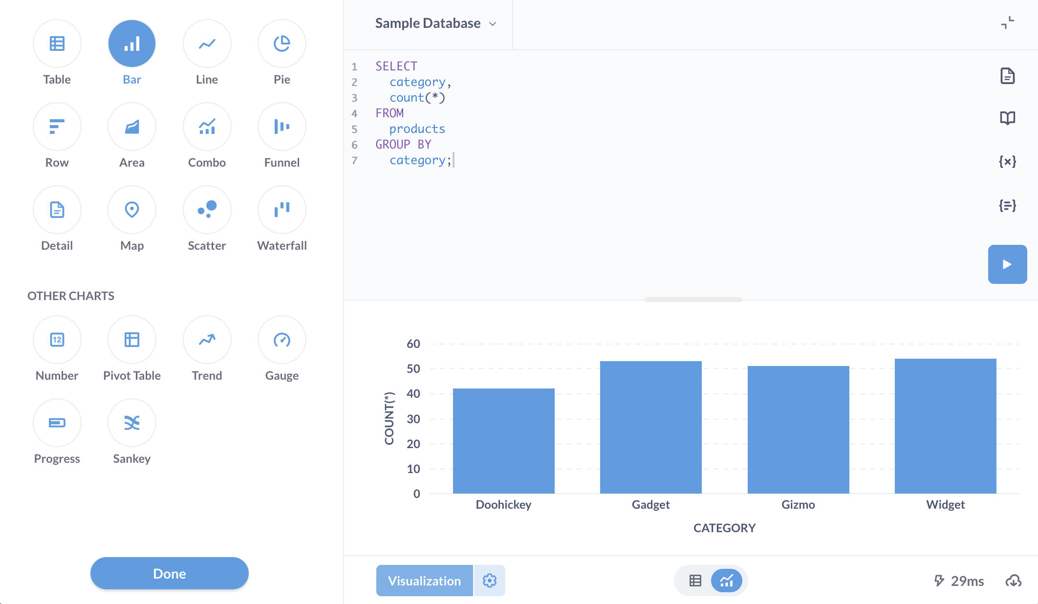
As long as the shape of the native query results is appropriate for the chart type - for example, a metric grouped by a date column for a trend chart - you’ll be able to use to use all chart types, except pivot tables. Pivot tables are currently unavailable for native queries.
Change visualization type
To change how the answer to your question is displayed, click on the Visualization button in the bottom-left of the screen to open the visualization sidebar.

If a particular visualization doesn’t really make sense for your answer, that option will appear in the “Other charts” section. You can still select one of these other charts, though you might need to fiddle with the chart options to make the chart work with your data.
Not sure which visualization type to use? Check out Which chart should you use?
Visualization options

Each visualization type has its own advanced options. To change the settings for a specific chart, for example a row chart, click on the Gear button in the bottom left.
Area charts
Area charts are useful when comparing the proportions of two metrics over time. Both bar and area charts can be stacked.

Bar charts
Bar charts are great for displaying a number grouped by a category (e.g., the number of users you have by country).

Combo charts
Combo charts let you combine bars and lines (or areas) on the same chart.

Detail
The Detail visualization shows a single result record (row) in an easy-to-read, two-column display.

Funnel charts
Funnels are commonly used in e-commerce or sales to visualize how many customers are present within each step of a checkout flow or sales cycle. At their most general, funnels show you values broken out by steps, and the percent decrease between each successive step.

Gauges
Gauges allow you to show a single number in the context of a set of colored ranges that you can specify.

Line charts
Line charts are best for displaying the trend of a number over time, especially when you have lots of x-axis values. For more, check out our Guide to line charts and Time series analysis tutorials.

Maps
When you select the Map visualization, Metabase will automatically try and pick the best kind of map to use based on the table or result set.

Numbers
The Numbers option is for displaying a single number, nice and big.

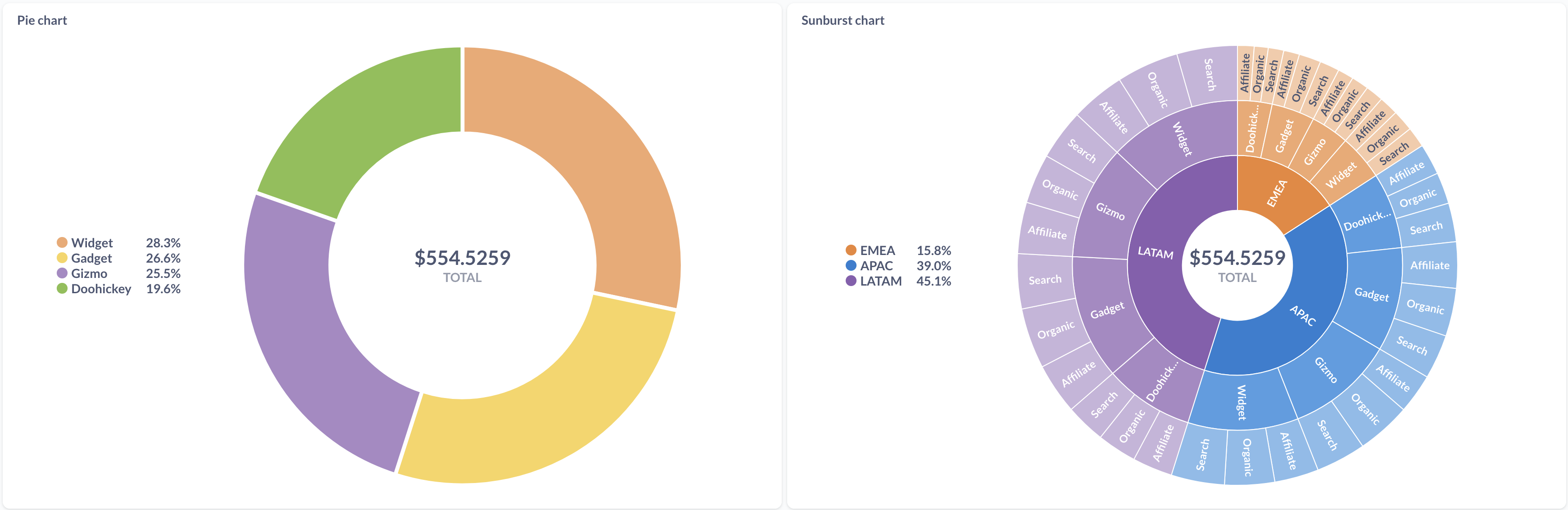
Pie, donut, and sunburst charts
A pie chart or donut chart can be used when breaking out a metric by a single dimension, especially when the number of possible breakouts is small, like accounts by plan.
A sunburst chart is a pie chart with more than one ring to show the data broken out by additional dimensions.
Pivot tables
Pivot tables allow you swap rows and columns, group data, and include subtotals in your table. You can group one or more metrics by one or more dimensions.

Progress bars
Progress bars are for comparing a single number to a goal value that you set.

Row charts
Row charts are good for visualizing data grouped by a column that has a lot of possible values, like a Vendor or Product Title field.

Tables
The Table option is good for looking at tabular data (duh), or for lists of things like users or orders.

Trends
The Trend visualization is great for displaying how a single number has changed between two time periods.

Histograms
If you have a bar chart like Count of Users by Age, where the x-axis is a number, you’ll get a special kind of bar chart called a histogram where each bar represents a range of values (called a “bin”).

Sankey charts
Sankey charts show how data flows through multi-dimensional steps.

Waterfall charts
Waterfall charts are a kind of bar chart useful for visualizing results that contain both positive and negative values.

Scatterplots and bubble charts
Scatterplots are useful for visualizing the correlation between two variables, like comparing the age of your people using your app vs. how many dollars they’ve spent on your products.

Styling and formatting data in charts

You can access formatting options for the columns used in a chart. Just open the visualization settings by clicking on the Gear icon in bottom left.
Options differ depending on the chart, and can include settings for the chart’s data, its display, and its axes.
See also Formatting defaults.
Further reading
Read docs for other versions of Metabase.